Regression Error Plots with Holoviews
I started playing around with Holoviews, a visualization library built on top of Bokeh. It allows you to build complex and dynamic plots with very little work and has a cool API for creating and composing layouts.
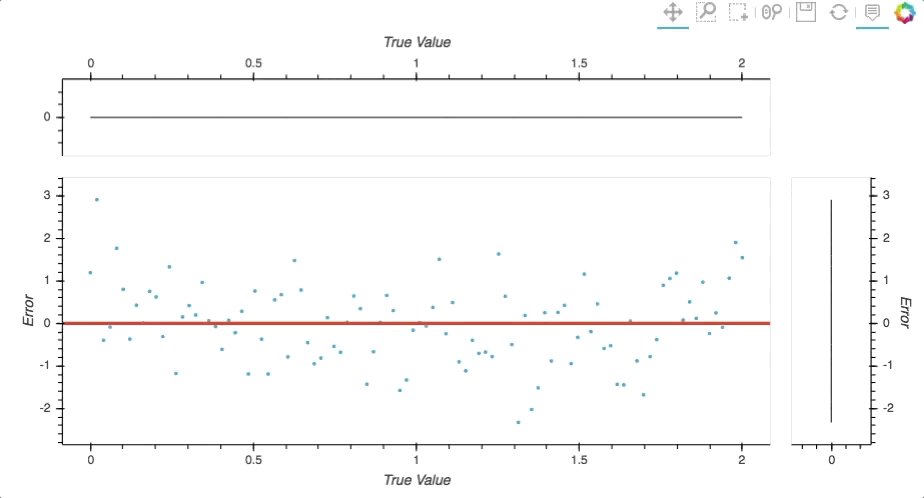
To try it out I created a more dynamic version of a plot I use every time I need to evaluate and debug regression models. It's a scatter plot of the predictions of the model vs the true labels. Instead of just showing the predicted value it shows the error made by the model. This rotates the plot 45 degrees and makes it easier to interpret it. With a single glance you can figure out what range of labels are harder to predict, the error distribution and the label distribution.
The Holoviews version gives you:
- The ability to dynamically focus on different areas;
- A hover tool with relevant information such as the error and index in the input array of a point;
- he mean error of the current selection (horizontal blue line);
- Panning, zooming, save button...
Without further ado here is the plot I will be using from now on.
y_true = np.linspace(0,2,100)
y_pred += np.random.randn(100)
errors_plot(y_true, y_pred)
As usual, the code is available at the folllowing gist.
Thanks for reading!